Designing YoU
Exploring Uncertainty through Typography
October 9, 2021

Image Description: Year of Uncertainty (YoU) Queens Museum graphic in light grey on black with thin, meandering line.
When the Queens Museum reached out to us* in December 2020 to help design an identity for the Year of Uncertainty (YoU), we thought: what could be a more fitting project for these times?! We set out to design a flexible design system that could accommodate the unknown set of experiments, conversations, and ideas that would manifest over the course of 2021 and beyond. Our conversations with Heryte Tequame and other staff members found us asking questions about what meaning the word “uncertainty” could hold? For some, it implies a feeling of anxiety, unease, and fear. For others, uncertainty can take on a sense of openness or playfulness—the delight of an unexpected outcome. In our early discussions, we leaned into this latter direction. These early sketches by our designers Inyeong Cho and Kellen Renstrom reflect the imbalance and energy that come from open-endedness.
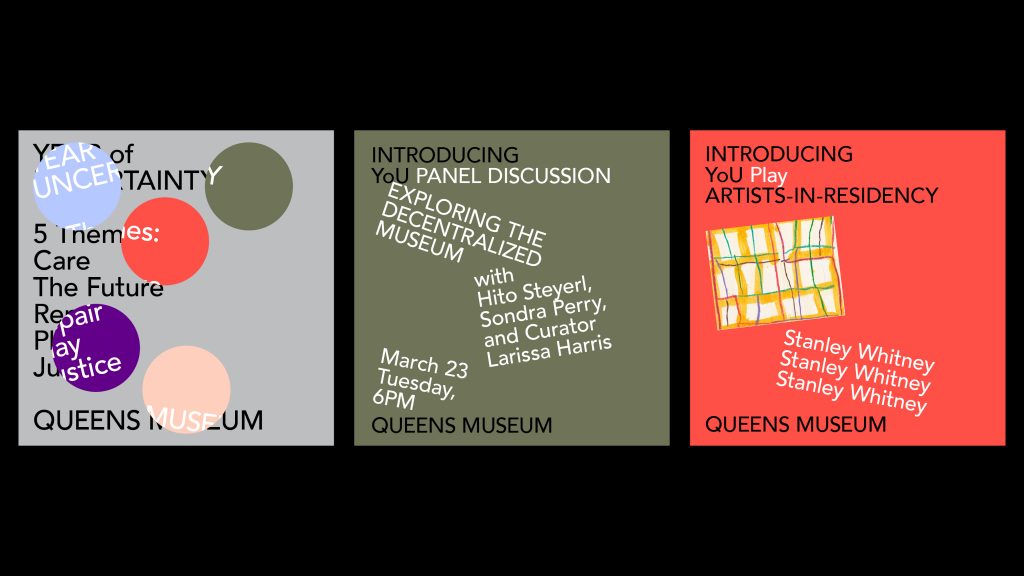
Image Description: Playful design for YoU graphics makes use of type on different angles, repetition and vibrant colors mixed with subdued grays and greens.

Image Description: Playful design for YoU graphics makes use of large “Y” “o” “U” letterforms in bright colors, neon yellow, red and purple,skipping across each surface.
We realized, definitively, that “minimal and neutral” were not terms upon which the Year of Uncertainty could be built. We had to throw out Queens Avenir.
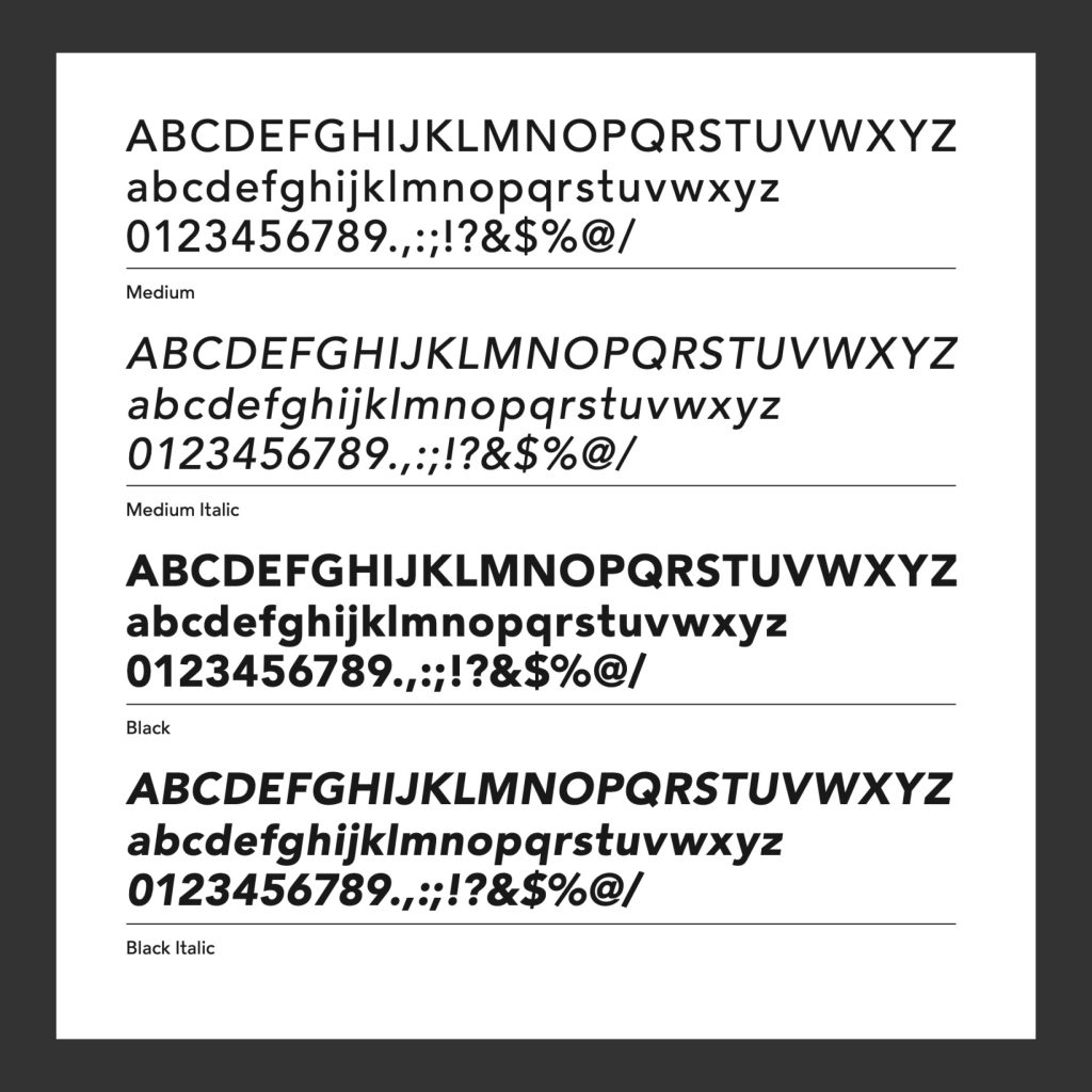
Image Description: Glyph chart for the font Queens Avenir, in Medium, Medium Italic, Black, and Black Italic weights.
Our next sketches explored other typefaces and methods for introducing qualities of instability and indeterminacy. We experimented with syncopated horizontal spacing to create openness in the typesetting throughout. We investigated using a font called “Redaction,” designed by our friends Jeremy Mickel and Forest Young, which had been commissioned by Titus Kaphar and Reginald Dwayne Betts’ The Redaction exhibition at MoMA PS1. In the following sketch we even began altering the Museum logo itself in a nod towards the various ways we might rethink an institution.

Image Description: Type-heavy designs exploring Year of Uncertainty, in a slightly fragmented font in pink, with a forest green background. The type moves horizontally back and forth to create a destabilizing effect.

Image Description: Type-heavy designs exploring Year of Uncertainty, with blue and red gradient backgrounds and condensed, tall neon type.
Ultimately, while we found these designs to be exciting, we also felt they were limiting in their capacity to accommodate multiple forms of content, and were overly complicated in their execution. We needed to find something that Museum staff members could easily design from and build off themselves throughout the year.
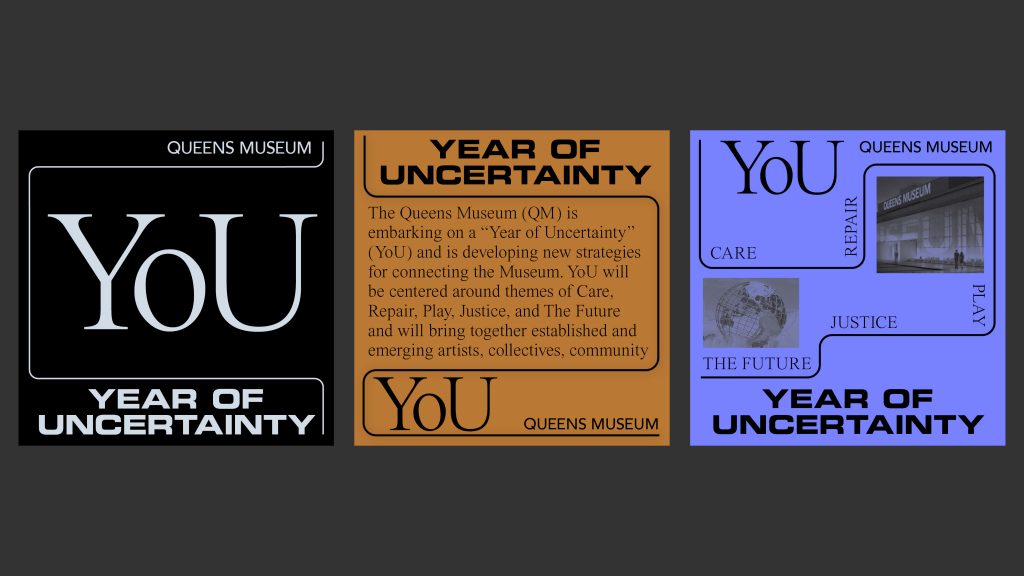
Image Description: Six different example designs showing YoU communications in different colors, orientations, and with and without images. The designs all use a wandering linear pathway to link different kinds of content.
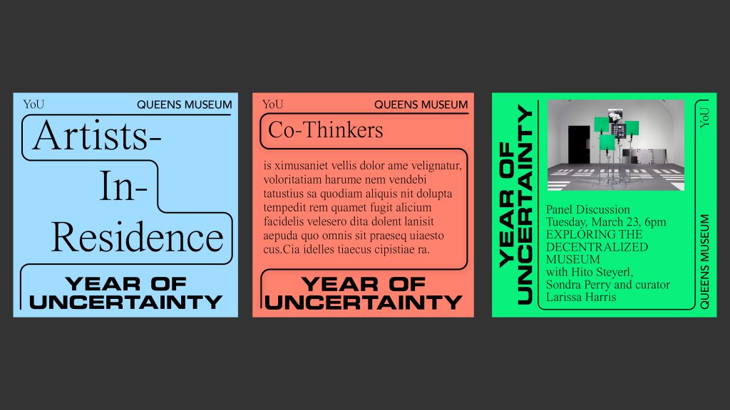
Image Description: Six different example designs showing YoU communications in different colors, orientations, and with and without images. The designs all use a wandering linear pathway to link different kinds of content.
These questions led us to the YoU design system we ultimately decided to pursue. The simple, linear pathway operates as an organizing tool for content, while also implying a journey—one without a predetermined destination. The openness of the design allows for an infinite variation of both content and media, while still providing a strong, consistent structural underpinning. The choice of the typeface “Eurostile” also felt right: originally designed by Aldo Novarese in 1962, only two years before the 1964-1965 New York World’s Fair. The font’s frequent use in 20th century science fiction materials also felt appropriate for YoU—acknowledging the past, while boldly exploring an unknown future for the Queens Museum.
In addition to the website you’re currently using, my studio New Information is also partnering with the Queens Museum to design exhibition graphics, printed matter, and, potentially, a book that all serve to communicate the work of YoU to the public.
*This project also came to us at a time of my studio’s own uncertainty. I initiated the YoU project as Wax Studios, led by myself, David Yun, and my business partner Zak Klauck. In March of 2021, Zak and I decided to start independent design practices. New Information, my new practice, was born out of a year of self discovery and uncertainty, and I’m thrilled to continue partnering with the Queens Museum and their community. We are incredibly grateful to the Queens Museum staff and YoU community for including us, to Zak Klauck and Kellen Renstrom for their insightful work on this project, and to Mitchell Barton at Cold Rice for his skilled web dev work.
Related Tags